In the past few years I've been scavenging the internet for some cool and powerful CSS tricks to help me build the styles for the most complex website designs. Now I have a nice collection of tricks that I use almost daily and I'd like to start sharing it with you.
So, the first trick I'd like to share works with ::after pseudo-elements.
What is a pseudo-element?
A pseudo-element is a keyword that you can add to a selector that allows you to style specific parts of the selected element. You can also use those pseudo-elements to insert content in a page without it needing to be in the html. in the CSS, they use the following syntax:
selector::pseudo-element {
    property: value;
}
Before proceeding, one important thing to keep in mind is that pseudo-elements can only be applied to html elements which can contain other elements, and not "self-closing" elements like input and img.
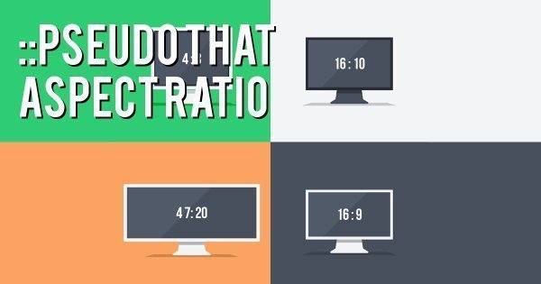
Sometimes you need that a div (or any other "wrapper") keeps the same height x width proportion in any view (mobile or desktop).
How to keep the aspect ratio of a block in a responsive design?
To achieve this we will use an ::after pseudo-element and padding-top. The padding-top, when set to a percentage, is (somewhat counterintuitive) relative to the containing block's width and we can use that to our advantage.
For example, Let's say you want a block to have initially 300px width and 150px height, and if the design pushes it to be smaller (a responsive rule for example) that it keeps the same ratio as before. here's how can we do it.
HTML
CSS
.same-ratio {
    position: relative;
    /* we will set the responsive width here */
    width: 100%;
    max-width: 300px;
}

.same-ratio::after {
    content: '';
    display: block;
    /* how much is the height compared to the width (%) */
    padding-top: 50%;
}

/* Any content needs to position absolute to not interfere with the ratio*/
.same-ratio-content {
    position: absolute;
    top: 0;
    bottom: 0;
    right: 0;
    left: 0;
}
With this simple and yet powerfull trick you can keep the aspect ratio from your original design into any views. If you'd like to see it working check out this codepen. Don't forget to resize the window to see it working properly.
Stay tuned for more tricks.